Was racier and, at times, more brutal than all we achieve with the most advanced CGI graphics today. Much has been said about the tendency toward nudity and eroticism in the crude days of early D&D's artwork.
But have you ever looked at some of the action pics? Check them out some time. The original
Monster Manual alone has some pretty rough pictures when it comes to violence and death. Sure, it's pen and ink - at best. Sometimes the drawings are cartoon-like, and that helps diminish the punch. But if you let your mind wrap around some of them, you'd be hard pressed to find a proportional level of graphic death and suffering in a modern SAW reboot.
Here are a couple to illustrate the point:
I've only used Rot Grubs a couple times. And I think our party only reached into an infested area once. It was pretty fun as encounters go. But the thought. If you stop and think of this pic, imagining it in modern, graphic imagery, this is pretty bad stuff. Given what my party went through with only a couple grub, this poor fellow isn't long for the world.
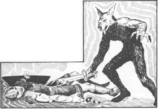
This is a case where the medium of the day diminishes what would be a graphic death scene if it was with today's production standards. That's a lot of blood. He's gone, and soon to be nothing but bones and rags once the jackalwere is through dining on him.
This is a case where the humor undercuts the graphic nature of this fellow's potential demise. Yes, he might make it. It looks like he's certainly not giving up. But half of him is already in the pike's maw, and that can't be good. Despite the goofy expression in the cartoonish presentation, that's nothing less than Quint meeting his demise in the jaws of another famous giant fish.
This one is also rough. In some ways, rougher than modern treatments. He's in agony and it's obvious why. Being eaten by a scorpion is never a good thing no matter how you slice and dice it. The flashy scorpion battles in the reboot of Clash of the Titans didn't come close to this level of horror, though the original Harryhausan version was much more atmospheric, and hence more terrifying in its own right. But in terms of intensity and violence, you don't get much better for old black and white drawing.
File this one alongside the Jackalwere picture above in the 'moderated by medium'. If this was modern art and graphics, that would be one serious demise. Far more graphic than most of the artwork in recent editions of D&D. Compare it to those, and this is nothing less than death, brutal and painful.
Perhaps one of the most graphic pictures in all of D&D - ever. Think about it. That poor fellow is one hapless and unfortunate man. His fingers are splayed, so he's still alive. Perhaps even struggling. But there isn't much struggle left. His chest on up is firmly engulfed in the mouth of the giant toad. Unless he has some buddies nearby, it's not going to be a pretty ending. Nothing in any recent D&D product art I've seen comes close.
Again, I realize that it is different, and in some ways, subdued by the limitations of the art form of the day. I know it's possible to have more blood and gore and shock in modern graphics. I know there are places where you can find much, much worse. But given the day, given that it was when audiences ran screaming out of the movie JAWS because of its blood and violence, and how restrictive things still were, you must admit that was some pretty graphic artwork for its genre.