Showing posts with label D&D Artwork. Show all posts

Tuesday, January 5, 2016

Speaking of Monster Manual Art


One of my favorite monster pics - ever.  Not least being because of the revisions of the Fire Giant in other, later versions of D&D.  Here, he is brute.  Just brute.  Not only brute strength, but brute.  And of course, a fine quality piece of work by Trampier.  One of the best. 

The Art of the early D&D

Was racier and, at times, more brutal than all we achieve with the most advanced CGI graphics today.  Much has been said about the tendency toward nudity and eroticism in the crude days of early D&D's artwork. 

But have you ever looked at some of the action pics?  Check them out some time.  The original Monster Manual alone has some pretty rough pictures when it comes to violence and death. Sure, it's pen and ink - at best.  Sometimes the drawings are cartoon-like, and that helps diminish the punch. But if you let your mind wrap around some of them, you'd be hard pressed to find a proportional level of graphic death and suffering in a modern SAW reboot.

Here are a couple to illustrate the point:

 
I've only used Rot Grubs a couple times.  And I think our party only reached into an infested area once.  It was pretty fun as encounters go.  But the thought.  If you stop and think of this pic, imagining it in modern, graphic imagery, this is pretty bad stuff.  Given what my party went through with only a couple grub, this poor fellow isn't long for the world.


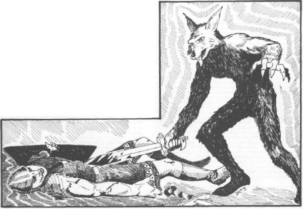
This is a case where the medium of the day diminishes what would be a graphic death scene if it was with today's production standards.  That's a lot of blood.  He's gone, and soon to be nothing but bones and rags once the jackalwere is through dining on him.  


This is a case where the humor undercuts the graphic nature of this fellow's potential demise.  Yes, he might make it.  It looks like he's certainly not giving up.  But half of him is already in the pike's maw, and that can't be good.  Despite the goofy expression in the cartoonish presentation, that's nothing less than Quint meeting his demise in the jaws of another famous giant fish.

 
This one is also rough.  In some ways, rougher than modern treatments.  He's in agony and it's obvious why.  Being eaten by a scorpion is never a good thing no matter how you slice and dice it.  The flashy scorpion battles in the reboot of Clash of the Titans didn't come close to this level of horror, though the original Harryhausan version was much more atmospheric, and hence more terrifying in its own right.  But in terms of intensity and violence, you don't get much better for old black and white drawing.


File this one alongside the Jackalwere picture above in the 'moderated by medium'.  If this was modern art and graphics, that would be one serious demise.  Far more graphic than most of the artwork in recent editions of D&D.  Compare it to those, and this is nothing less than death, brutal and painful.  

Perhaps one of the most graphic pictures in all of D&D - ever.  Think about it.  That poor fellow is one hapless and unfortunate man.  His fingers are splayed, so he's still alive.  Perhaps even struggling.  But there isn't much struggle left.  His chest on up is firmly engulfed in the mouth of the giant toad.  Unless he has some buddies nearby, it's not going to be a pretty ending.  Nothing in any recent D&D product art I've seen comes close. 

Again,  I realize that it is different, and in some ways, subdued by the limitations of the art form of the day. I know it's possible to have more blood and gore and shock in modern graphics.  I know there are places where you can find much, much worse.  But given the day, given that it was when audiences ran screaming out of the movie JAWS because of its blood and violence, and how restrictive things still were, you must admit that was some pretty graphic artwork for its genre.

Sunday, October 5, 2014

Players Handbook Pics the Final Post

Yes, I'm sure everyone has been waiting for it. After a break due to time and commitments, I finish up my look at the art of the 1st Ed. Players Handbook.  And what a look it's been.  That stuff is great!  Most of it anyway. It's not as flashy as modern CGI enhanced graphics to be sure.  But just as CGI in movies usually fails to convey the same feeling of real that even a fake claymation animation can accomplish, so old time paint and ink drawings can sometimes say more and feel more that modern multi-colored computer laden graphics.

So for instance:


What can be said about this that hasn't already been said?  One of the most iconic images of the Dungeons and Dragons, or any, product.  James Maliszewski does the full review here.  I would say I'm not quite so enamored with the pic.  I always felt the devils seemed somewhat blah, just standing by watching.  Team up on him!  But the point is made.  And especially the historically accurate armor and realistic equipment, as opposed to the post-goth Gen X punk rebel look that adorns so much modern interpretations.  It is a great piece of work.  And again, it conveys the mood, the feel of the game.  And that's what the art is for, to capture the feel and inspire.  And hesitant devils and all, it does all that in spades. 

But there are some others worth noting.


This is in the section dealing with Successful Adventures.  A part I didn't read for decades.  I'm not sure how many have.  But it deals with the nuts and bolts of how to adventure.  One of the distinctives of the early rule books was how they assumed the players really knew how to play.  I mean, there's really no instructions that say 'roll dice, move three spaces, take card.'  It just assumes.  But there is this little section that at least gives and idea what to say you're character is doing.  And in this part that deals with poison, a subject that has undergone changes over the years, this little illustration is just a filler piece.  A good one.  But that's all.  Though the poison jar looks almost like an ink bottle, and I think the first time I saw it, that's immediately what I thought.


The above two illustrations are early in the book, in the section dealing with character classes and race limitation.  A reminder that the early game was inspired by other genres of entertainment.  Not to mention some good old game mechanics that hearken back to the wargaming roots of the hobby.  After all, any wargamer will tell you that part of the fun is robbing Peter to pay Paul.  If you want this unit, you have to pay.  And it has benefits and shortcomings.  Same with early D&D.  You want the awesomeness of an elf?  Well, you'll have to pay in limitations.  Though in my world, the Grey Elves occupy the more Tolkienized version, and their limitations, though present, are far less restrictive. 

Anyway, the above illustrations really don't say anything about that.  One shows what appears to be two dwarves fighting a very large snake.  The other shows men fleeing from the lethal gaze of a catopblepas (another reminder of the strong debt to classical literature and mythology in the early game).  But neither has much to do with the surrounding subject.  One of the few cases in which that is true.  Plus, they're not the best quality, almost appearing as dashed-off afterthoughts.  Not horrible, just not the same level as many of the others, nor really helping convey feelings about the  content since they really have nothing to do with the surrounding text. 


If the previous two seemed out of place for their placement in the text, this illustration is spot on.  In the closest thing to actual play instructions in the manual, this falls into the section dealing with surprise movement, and tricks and traps.  And it shows all three!  The detail is fine.  The troll is based firmly on the Sutherland artwork in the MM.  That artwork, as much as any from the early books, set the standard that all subsequent renditions of the troll have to accommodate. And here, it is that version we see.  No explanation needed.  

There are two ways to see this.  The adventurer is luring the troll into a trap.  Or the troll is luring the adventurer.  Given the poses, it's most likely the second.  The troll seems ready and waiting.  The adventurer is on the move.  There's movement.  Either way, it's a trap.  And of course, assuming the adventurer is the target, he's going to be mighty surprised to walk around the corner and see the troll waiting.  Though you have to admit, that's one stupid adventurer, if in monster infested corridors he finds a string and can only think to follow it.  

The last pieces come from the appendix.  A section of the PHB that has been the source of countless moans and groans and 'if I had it to do over' statements. There is little artwork there, and most of it is filler at best.  These two pics, for instance, convey the subject at hand, but do little else: 


The last two are less pictures as much as graphic illustrations.  Apart from the charts scattered throughout the early rule books, little actual graphic help exists for the person trying to make sense of things.  Today, rule books, text books, how to books are laden with full color graphics and illustrations that show step by step what is expected.  But then, it was a little more text heavy.  Illustrations existed, especially in some home repair or auto repair manual.  But they were otherwise quite rare.  

So though these enter in at the end, and are the only real 'here's what we mean' game aids, they do the job quite well:


The first is the alignment chart.  With AD&D expanding the wargame based three choice alignments, and adding the moral elements, the chart gives a good shot of what Gygax intended in his own mind when it came to how a particular character or monster should act. 

It's noteworthy that the changing times are illustrated in this as well.  Lawful Good, in many later renditions of the game, came to be almost intolerant, harsh, judgmental. Even fanatic.  As society moved away from its Judeo-Christian roots, the more chaotic good seemed the preference.  Here, however, the Lawful and Good is "Saintly".  Though it's worth noting that Chaotic Good is no less praiseworthy. Sometimes the strangest things can be a commentary on the changes that occur in a given culture. 

The bottom illustration consists of two parts.  The Inner Planes and the Outer Planes.  You have to love the little elemental illustrations in the Inner Planes panel.  Especially the cloud blowing air.  That is classic, and almost a nod to childlike illustrations for younger grades that weren't really the target audience for D&D in 1978.  The straightforward model of the underneath simply shows where everything is, at least in relation to the alignment chart above.  Though they hadn't been unpacked as they would in later releases, there was something there to tantalize, to want more.  I always particularly liked the endless spiral of the Abyss.  

Anyway, there you have it. The art of the PHB.  As I said, I never paid it much attention, feeling that the MM and the DMG had the  better hands when it came to artwork.  But since I've spent more time in more of the book these last years, I've come to appreciate the artwork more than ever.  In the vast universe that is Dungeons and Dragons, I'd put it among the best there is, and some of the pieces I'd put at the top of any list for any product ever.  And that's high praise. 

Sunday, July 27, 2014

And yet more PHB pics

Again, I didn't realize just how much artwork was in the Players Handbook.  Art in the early D&D versions was important.  There was no Internet. There were no smartphones.  The publishing industry itself, like much of the commercial sector, had not exploded into its vast and sprawling dimensions that exist today.  A huge Barnes and Noble was inconceivable then.  Except for Walden's Books in a shopping mall, most book stores were still rather tiny affairs.  Outside of major cities, the choice for obtaining publications was, compared to today in the post-Amazon world, extremely limited.

And so a game based on using your imagination needed some visual aids.  Even if some might lament the artwork as the beginning of canonizing what certain things were supposed to look like, the art was still important.  Especially for those, like me, who came into the hobby from outside the 'fantasy/wargame' circle.  Many things referenced even casually in those books would have gone over my head.  I hadn't discovered medieval history, and didn't care much for fantasy, so I couldn't have understood some of the references (see my post about the Wight and how I imagined it the first time I heard the term).

And in terms of helping, the PHB actually has many great pieces.  Today, thought I'd slip in a large collection found through the spells section.  Since I didn't play spell casters, ever, in any game I was involved with, I didn't usually pay much attention to this large hunk of the book.  But now, being the DM, I've been forced to read up on the different spells.  I already mentioned a couple pics from the section. Here are the others.


This little gem sits at the beginning of the section.  It's sort of a hodgepodge of different images.  Nothing altogether special or imaginative.  A ghost, dragon on a perch, Quasit on his shoulder, and something really, really scary in the background.   Sort of a composite mural like the Monster Manual cover.  But unlike that bulky and patchwork piece, this one works.  Perhaps it's the  black and white, or the arched window bathed in moonlight.  The wizard is well drawn, and the all important tome carries with it that feeling of a large, almost intimidating, medieval codex.  For whatever reason, though, it invokes a feeling of spell caster delving into forbidden arts in a dank, dark corner of the castle, or monastery, or other such structure.  And for the section it is introducing, that's all it needs. 


Two Magic User spells.  Shield and Dancing lights.  The shield pic almost has a sense of comedic, with the sneering imp, again on the wizard's shoulder.  The detail is first rate, and the small trinkets and tiny accessories dangling from the wizard's outfit adds depth.  That's one effective shield spell, by the way.  

Underneath is the Dancing Lights spell.  On one hand, the picture doesn't really convey the usefulness of this  spell.  We can see they are only lights, not torches or anything we might be fooled into thinking.  On the other hand, it shows what the spell does do.  Perhaps it looks fake now, but once it goes further down that dark staircase, whatever is at the bottom will imagine a torchlight procession and spring the ambush.  Because it shows exactly what the spell does, it works.  


Black and white, pen and ink, sometimes have their benefits.   Sometimes, however, they are limited.  And some of the spells would be difficult to visually convey in the best of circumstances.  Mirror Image and Massmorph are two such spells.  Just try to visualize in your own mind how they would work.  And then with the limits of the medium at hand, attempt to show it in a book.  I don't think these two attempts are horrible, they just fall short as probably most attempts with such restrictions, and at such a point in history, would have done. 


That's Leoumund's Secret Chest.  Not overly inspired, but it does show an otherwise uninteresting little container appearing extremely valuable to the individual portrayed.  I always wondered if that was supposed to be the famous Leomund himself.  


Neither cleric nor druid spells account for many illustrations.  In the cleric's case, it may be the more defensive, and miraculous, nature of the spells.  Cecil B. DeMille aside, it isn't easy to wrap one's brains around miraculous occurrences.  When we do, we usually fall short of what they really are, and because of that, tend to dismiss them outright.  The sole cleric spell illustration was the already referenced Locate Objects.  The Druid doesn't do much better.  Here are Fire Trap and Warp Wood.  

The Fire Trap illustration is so-so.  Yeah, he's in it now.  He opened what shouldn't have been opened and something bad has happened.  The problem is, there's a disconnect.  Is he just shocked?  Scared?  About to get scorched?  This picture was almost there, but nto quite.  The Warp Wood, on the other hand, nails it  That's what Warp Wood does - it warps wood.  Though almost tucked in a bottom corner and easily missed as nothing but decorative bordering, the illustration does an excellent job of fleshing out the spell description.

Another 'blink and you miss it' illustration.  Those are insects.  And while I wouldn't want that bunch coming at me, I'm not sure it captures just how horrible the spell is supposed to be.  The spell is in the process of forming.  Yet I can't help but feel the picture sells short the spell's effects. 

One of only a couple Illusionist pics.  Illusionists themselves have always been a tough sell, and quite frankly, I've had a hard time managing illusionist based spells.  My most effective was when my party went through a haunted manor home for an October Halloween themed (and timed) adventure.  Otherwise, they've been tough to get my head around.  This illustration for Demi-Shadow Monsters, different in style and presentation than most of the spell illustrations, somehow works.  No particular monster from the books (a devil perhaps?), it still suggests 'shadow' as much as monster.  But getting that into a verbal game description, now there's the challenge.


We're getting into higher level Magic User spells with these.  In my Greyhawk world, magic is rare, mysterious, and suspicious.  Higher level spells for any class are difficult to come by.  Some are practically non-existent.  So I don't have to worry about these for a while.  Still, they are a good contrast.  The top one, Shape Change, doesn't really show the spell.  It shows a big, nasty, fanged frog jumping at a sprite maybe?  We're to assume it's a shape changed Magic User.  The frog that is.  Or perhaps the sprite.  Or maybe it's both.  Not a bad illustration, but it doesn't tell enough.

The other is Otto's Irresistible Dance.  Spells and formulas that made people dance unwittingly go way back, and old Otto might just be based on one of those legendary examples.  Here, however, you have an almost childish portrayal.  That's an Umber Hulk.  What is really a big, bad, terrifying original creature.  Here, it looks downright goofy.  Not because of the dance, but because of how it was drawn.  I think it would have been more effective had the Hulk been better detailed, then the dance's effect would have been better.  As for the characters, I've never figured out if the fellow in the front is pondering what he sees, or holding back the giggles.  Either way, it's not the most inspiring of the pics, though it does do the important job of showing what the spell actually accomplishes.


That's Gate.  A demon, probably a Balrog Type VI demon.  That's what Gate does.  It summons demons.  The pic doesn't really show the Gate in action.  There are no inscriptions on the floor or in the crossroads with dragon's coils flashing across the sky.  There's just this.  A demon.  That's what Gate does.  Who uses this at all but to summon demons?  If my Greyhawk world is low in magic, it's high in superstition and in its connections with the supernatural.  Everyone is always trying to summon demons or devils, because that's how you get some of the biggie spells.  Especially the Wish granting Arch Devils.  Wishes don't grow on trees in my world, not now in its present era.  So you have to climb a mountain, cross a sea, or summon something either gracious enough to bestow a wish, or diabolical enough.  And remember, if you try, this is what you'll see.

A fitting end to the Spell Pics section. It illustrates the Write spell, an odd spell that seems to be a way of dodging the rules based restrictions for accumulating spells.  It's a fine illustration, tucked neatly away at the bottom of the page.  The barely discernible runes or letters, some form of an illustration, perhaps a hand.  It does nicely, and invokes that notion of an arcane tome possessing some form of ancient power.  And that, kiddies, is just what all this magic stuff is about in the first place.  

Sunday, July 13, 2014

Art of the Players Handbook Part II

So a few more pics from that worthy tome.  As I said, I never paid much attention to the artwork in the PHB back in the day.  But recently I've come to appreciate it more than ever.

One of the things that defined the early D&D artwork of the AD&D period was off handed humor.  This was reflected in the occasionally cartoonish additions to the visual aids that popped up every now and then.  Several are well known from the DMG, but these two show that the whimsical wink and nod of those first years of the hobby were quite alive and well before the DMG.  The interesting thing about these is that part of the set piece in each picture is quite good, quality sketch with attention to detail.  And then a cartoon is dropped in to change the entire feel of the picture.  Sort of like the game itself - never take it too seriously.


The thief class gets its own illustration in this one.  Not one of the better pictures to be honest.  The poses are bulky and awkward.  The atmosphere is there, but the overall detail not up to what it is in some other pieces.  I've always thought the thief looked a bit like Tony Curtis. 


The poses and the basic quality of this picture, in fairness, aren't much better than the above thief.  The look of the people is somewhat stiff, not quite there.  I can't say why, but the detail just doesn't rise to some of the other pieces, even for those that were done in this 'nitty-gritty' style.  Still, the overall picture somehow manages to capture a feeling, especially given its place in the book.  Kicking off the section on adventuring, it manages to get that 'feel', and since that's the job of these illustrations, I could say this succeeds.


Another in the 'nitty-gritty' realism series.  This one works, and does so wonderfully.  Mostly because there is nothing fantasy about it.  It could be an illustration in some historic reenactment village.  This is for the spell Enchant an Item.  The spell itself shows the differences between the early incarnations of D&D and later versions.  The description of the spell attempts to take the reader into a real world where enchanting an item is actually a long, arduous task.  That fellow is hard at work.  This was the 70s.  The decade of "realism" after all.  The spells reflected that.  And this picture does so nicely.


Almost whimsical in its presentation, nonetheless it is one of the best 'feeling of the game' pieces in the early books.  This is the game.  This is riding off the field on the teams' shoulders after the victory.  Sack of gold over shoulder, comrades raising a triumphant ax in the day's sunlight, victory is won!   What was behind?  Who didn't make it?  Are there others?  After a long, dark and dangerous journey in utter blackness, light - beautiful, wonderful, hug it light - greet the exuberant adventurers.  A pithy picture, but one that packs quite a wallop.  


One of the master works of the D&D canon.  The great Tolkien Debates (how much was Tolkien an influence on D&D?) gets a nudge in one direction with this one.  That could be Bilbo with Thorin and Company fast on his heals.  Of course the scene doesn't happen in Tolkien's universe.  And likely wouldn't.  A Magic Mouth in Middle Earth?  Perhaps.  Think the Watchers of Cirith Ungol.  Nonetheless, it's not straight from any Tolkien publication.  Yet it is awesome in every way. Like so much "Old School" art, it tells a story, and does so based on the characters and descriptions from the text.  Hafling?  Check.  Dwarves?  Check.  Magic Mouth?  Check. 

It also tells a story while leaving much out.  Another hallmark of early D&D art.  Those dwarves and that halfling (oh heck, that Hobbit), came from somewhere.  They are going somewhere.  Torchlight.  Again that the wonderful use of pend and ink to give a dark and dank appearance that won't appear in later versions of the game.  And look at those eyes at the bottom of that dreary stair.  It took a long time for me to realize those weren't just glitches in the print.  What are those?  Smaug?  A dragon?  Something else?  Do the explorers notice?  Is the Magic Mouth warning them or egging them on?  A story is being told.  And that's the essence of the game.  And not just a story, but a game story based on a rich and deep heritage of culture, literature, myth, folklore and legend.  

Sunday, July 6, 2014

Art of the Players Handbook

I mentioned the impact that early D&D art had on the potential consumer back in the day.  Like many things in our internet age, there is a tendency toward scorn for those early D&D years when it comes to art.  A few - David Trampier most notably - are given kudos.  Much of the work, however, is dismissed as amateurish at best.

In fairness, some of it, particularly that from the original 'LBBs' was downright childish, almost as if penned by an art class in middle school.  But by the time the hardbound books began to appear, a new level of art emerged that sought to capture the feel and spirit of the game.  And in those days, before Google could drop ten thousand computerized images of a basilisk on your screen, seeing what was being described was crucial for a new consumer base.  As I said, it took the heart of the game and gave it a look to pique the imagination.  And for a game based on using the imagination, that was as important as oxygen.

In those days when I first encountered the hobby in the early 1980s, any artwork was worth its weight.  It goes without saying that the Monster Manual reigned supreme in that category.  And while a few of the pictures seemed a bit cartoonish, most were respectable enough.  The Dungeon Masters Guide was also a treasure trove of imagery and artwork, with several pictures - especially in the second half of the book - evoking a fantasy world view to help sum up what the game was about.

Oddly, the Players Handbook came off as more the valuable text than a source for artistic inspiration.  Back in the day, it was the necessary rule book, but not a place for tweaking the fantasy images.  The artwork seemed minimal, and sometimes merely a dashed off afterthought.

Today, however, as I look through the books, I'm taken by just how plentiful the images were, and the quality they possessed.  Not only did they do what early artwork attempted to do - take the actual game and put it in pictures -, it did so very well.  Not the sleek, slick CGI laden comic book art of modern D&D publications.  But you have to remember, this was the 70s, the decade of realism.  When even George Lucas insisted his special effects team make that galaxy far, far away look lived in.  The art of D&D would likewise take the point of view of the creators and attempt to make it at once a fantasy world, and yet one that would never be beyond our capacity for belief.  It was grounded.  It was at times evocative of classical images and artwork.  And it was all brand new.

Here are a few to begin with.  I'll post more later.

After the celebrated cover pic (which I'll comment on down the road), this is the first bit of interior art that greats the reader.  Right there it says it.  A professional level drawing that in all respects could fit a fantasy book cover.  Except the die.  It's that die that says 'this is different.'  This is about more than just fantasy.  It is, in the end, a fusion of two types of traditional pastimes: imagination and games.  Without hammering the point, it makes the point.  And that is good art. 


Not one of the better illustrations.  It's actually in the 'amateurish' category.  It also adds fuel to the great debate on Tolkien's influence.  After all, that elf is no Galadriel.  It's also worth noting that the human is either over 8 feet all, or that's one small dwarf.  


On the other hand, that elf is holding his own height-wise.  Striking a noticeable similarity to that famous Vulcan Mr. Spock, either the other two men are short, or that's a six foot elven magic user.  Note the cross on the warrior's chest.  Probably a cleric.  Which brings a few other pics worth noting in that category. 

These are three pictures from the PHB that shows clerics in various action poses.  More than once James Maliszewski argued that early D&D had an implicit - if not perhaps an explicit - Christianity in its presentation.  Not hard to believe.  Despite the cultural upheaval of the 60s, America was still heavily based on a Judeo-Christian worldview.  Even if that was eroding, it was still there.  Pick a pop-cultural reference, and if a religious person was needed, he or she would either be Jewish, or more likely, a Christian minister or priest.  For better and for worse.  So it's no surprise that the cleric, already based on  a combination vampire hunter/Christian crusader model, would be portrayed as a warrior of the holy orders.  And that happens in the PHB more than in any other single publication.  


Finally we have another action pic of dwarves.  This was one of many art pieces meant to show the D&D world in action.  These are gritty, grimy dwarves at work.  Note the darkness of the work.  The shadows.  The heavy shading.  Illumination by way of torch.  This is the world of D&D.  Years from now, when the dwarves have left (or have been driven out), this is where those adventurers we play will be exploring.  And from the looks of things, they'll have to crouch down or send in the halflings.